Streamflow Reconstructions from
Tree Rings: an Example from Middle Boulder Creek
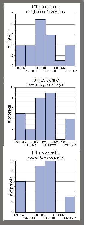
Figure 4. Graphs
showing the distribution of extreme low flow single years, 3-year and 5-year
averages over roughly half century periods. The numbers of years or events that
fell within the driest 10% of years or events are shown on the y axis, while
time periods are shown on the x axis.
Use your back key
to return to article.
Return
to Drought, Fire & Flood Homepage
Drought
- Fire - Flood
- It's All Connected
INVITATION
BASIN is a community project actively seeking public participation. We
appreciate all feedback and welcome comments, suggestions and contributions.
To find out more about how you can be involved, click here.
|
|
| BASIN is supported by the US EPA, the City of Boulder, WASH, BCWI and BCN |
|
Home
| Site Map
| Glossary
| Bibliography
| Contributors
About BASIN
| Attribution
| Feedback
| Search
|